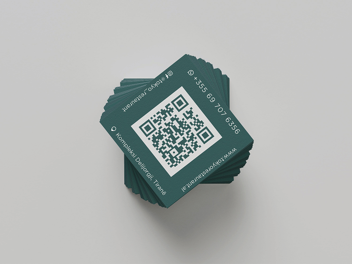
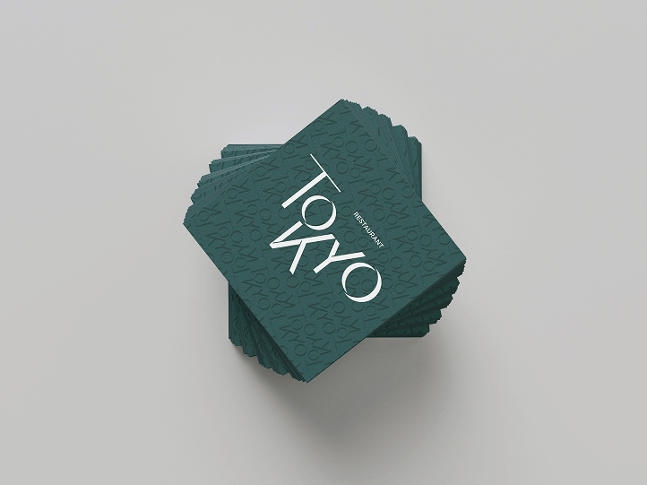
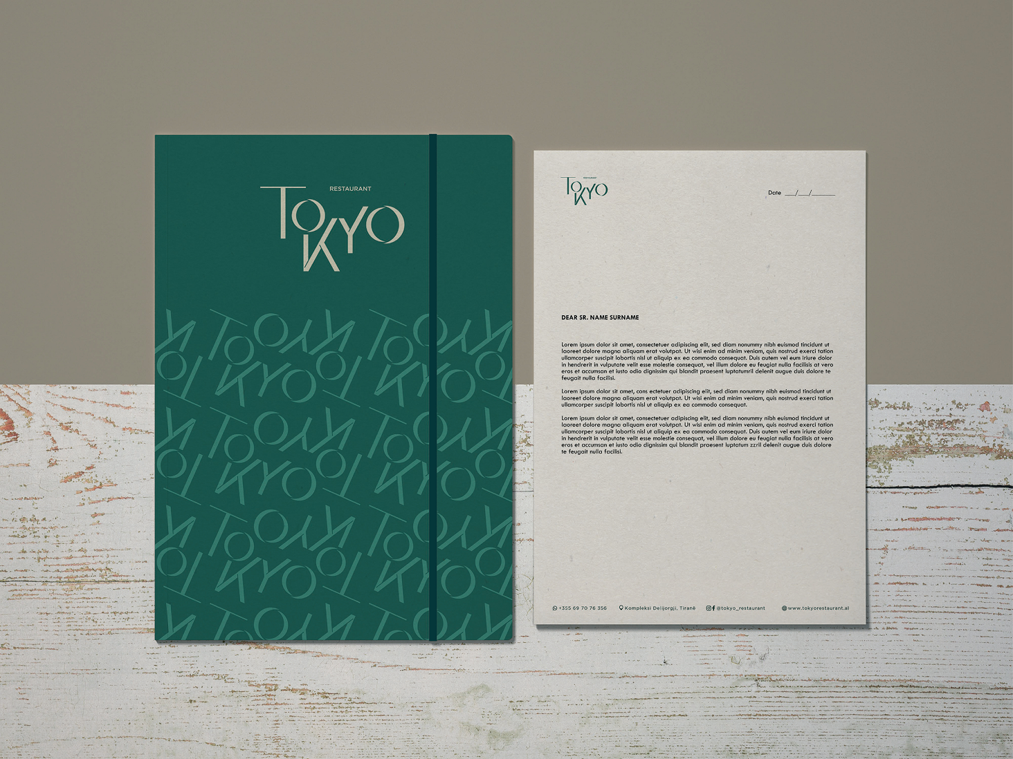
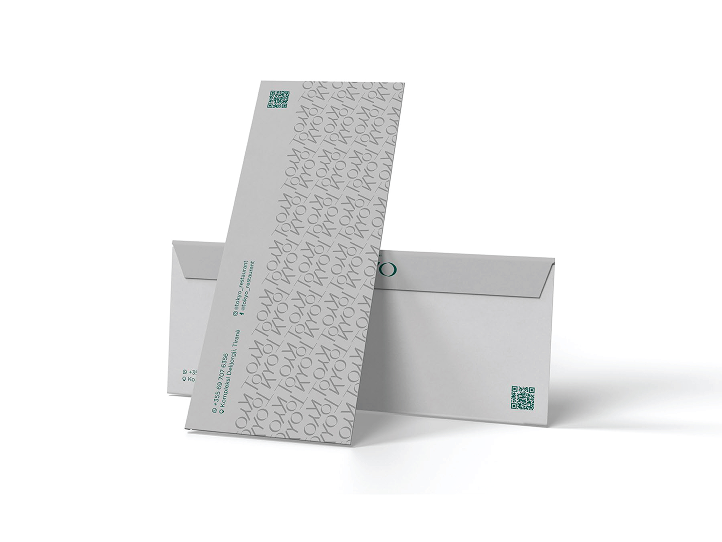
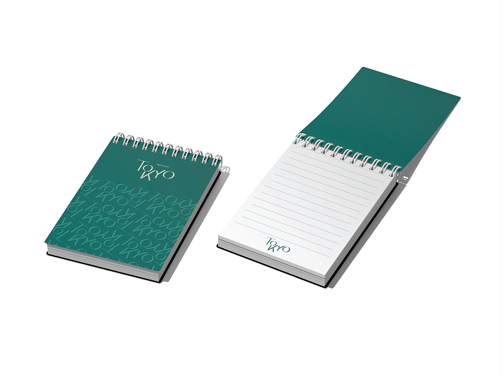
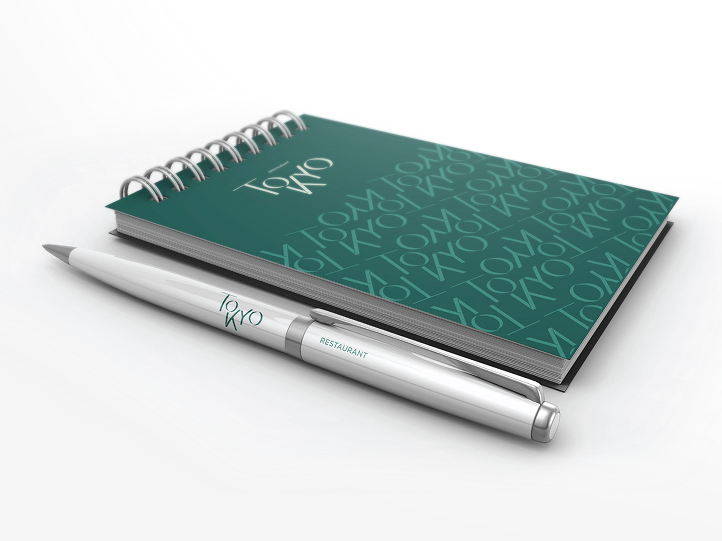
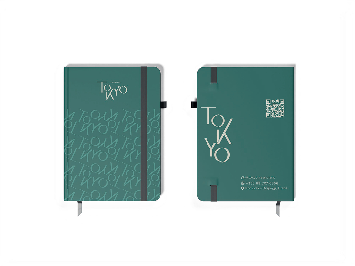
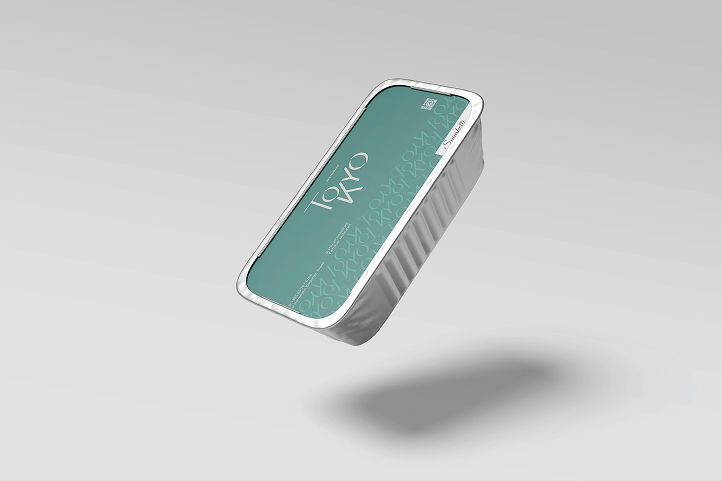
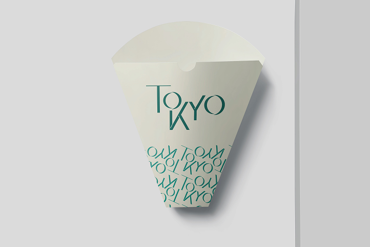
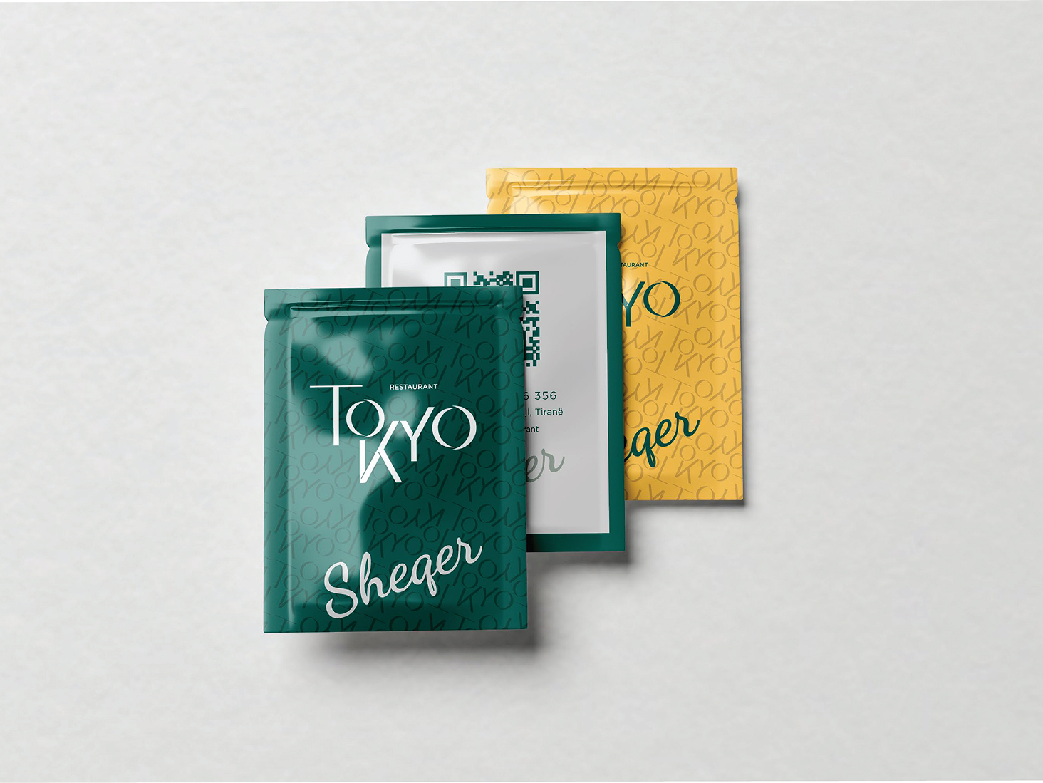
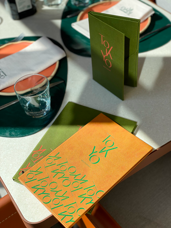
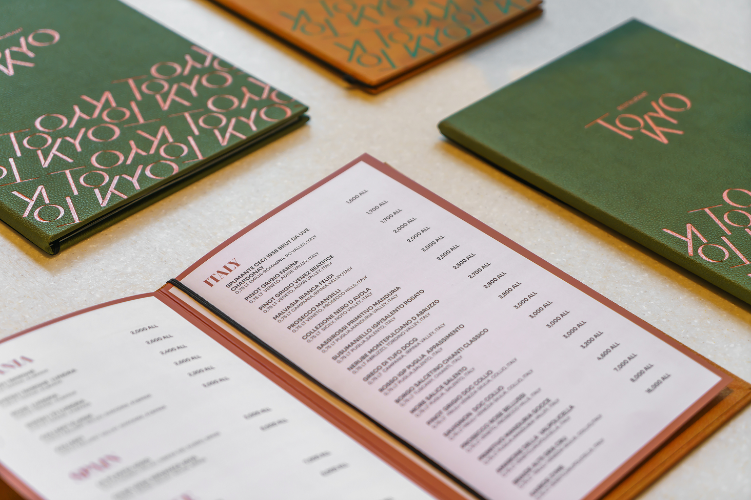
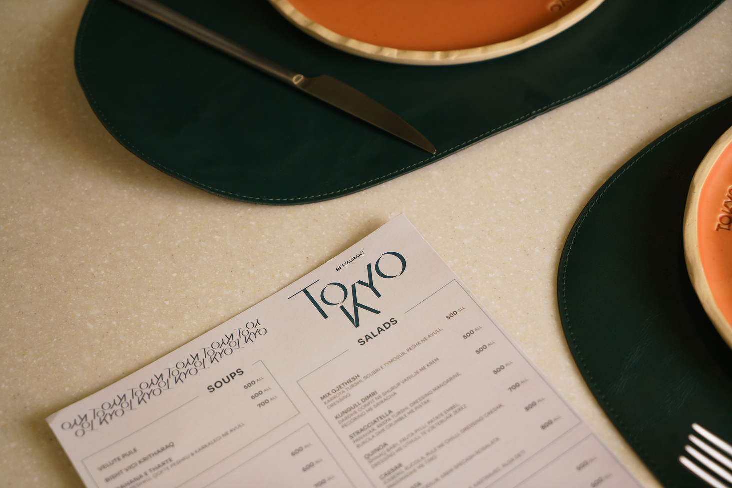
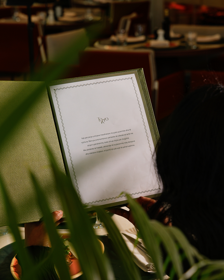
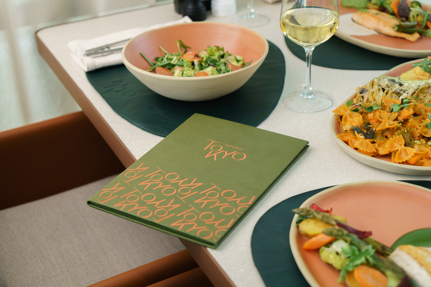
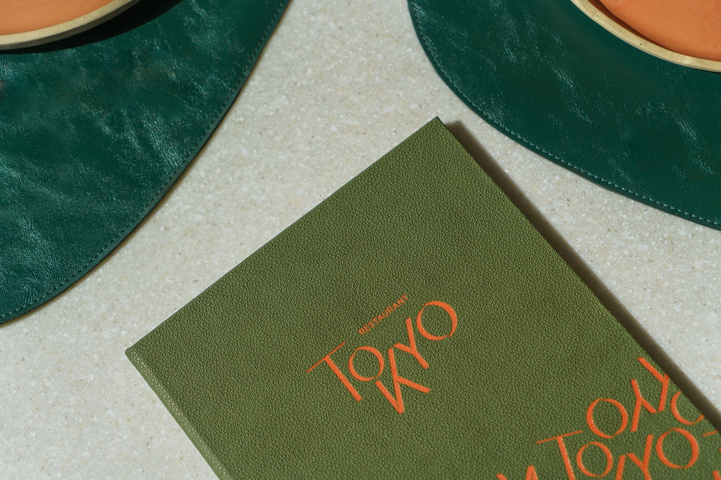
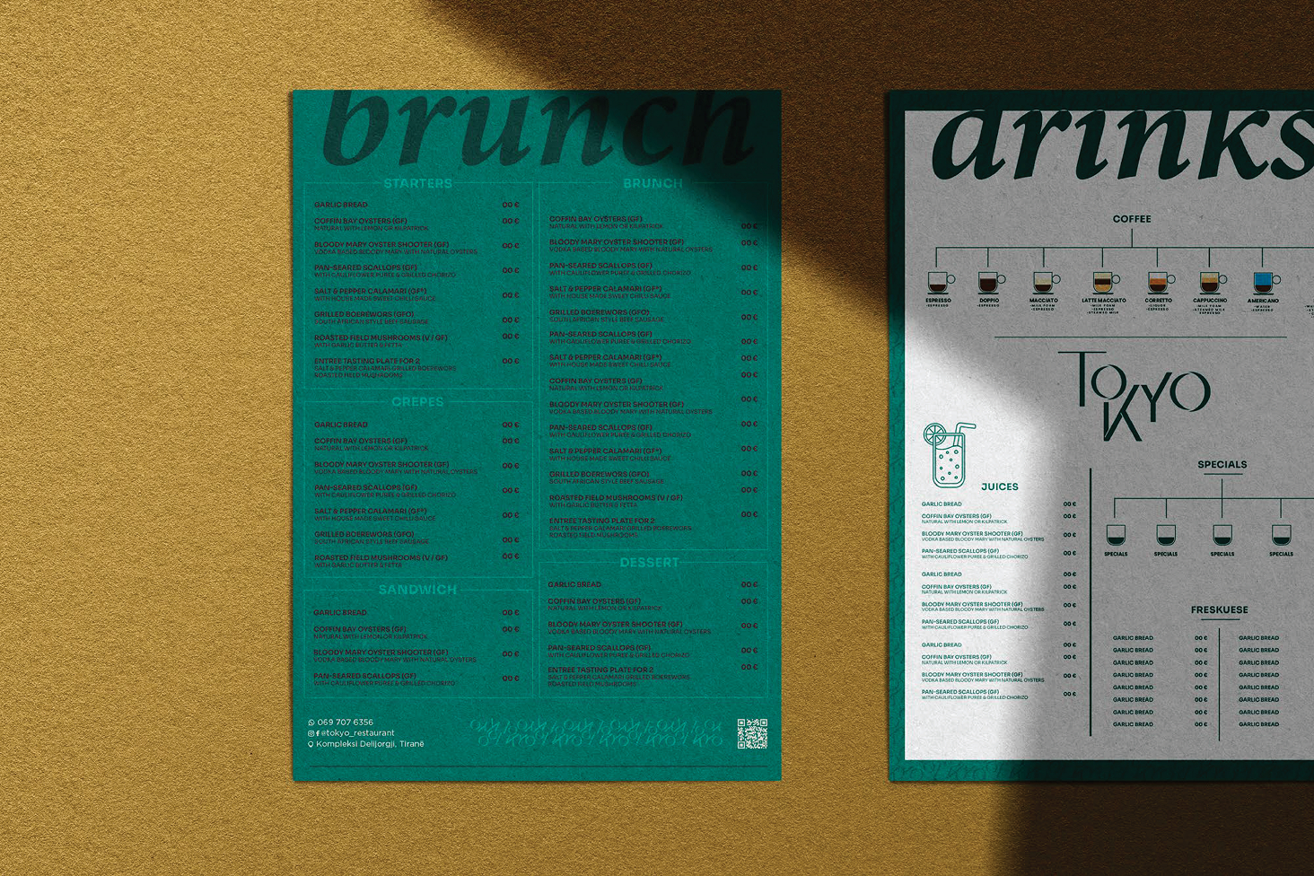
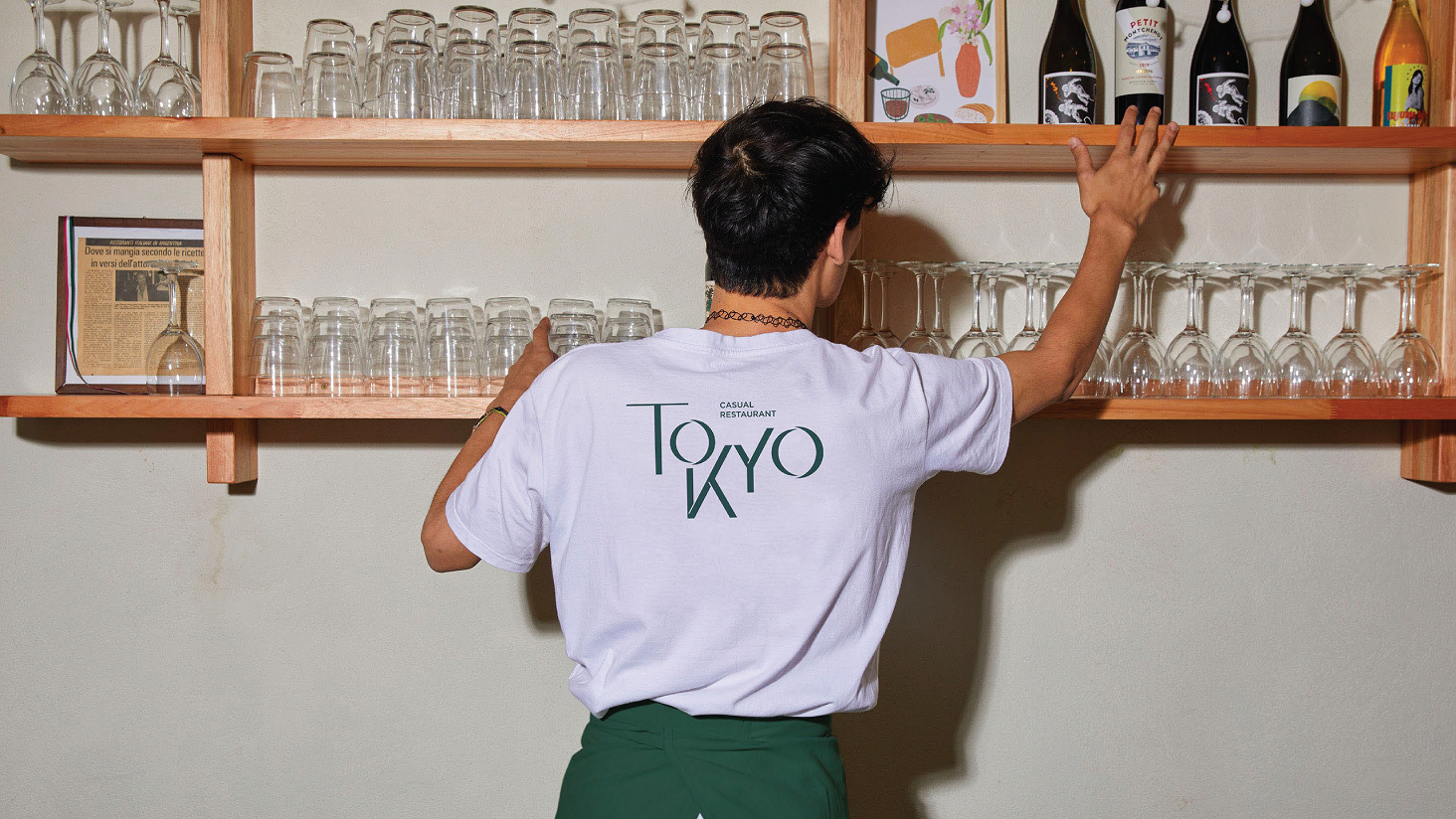
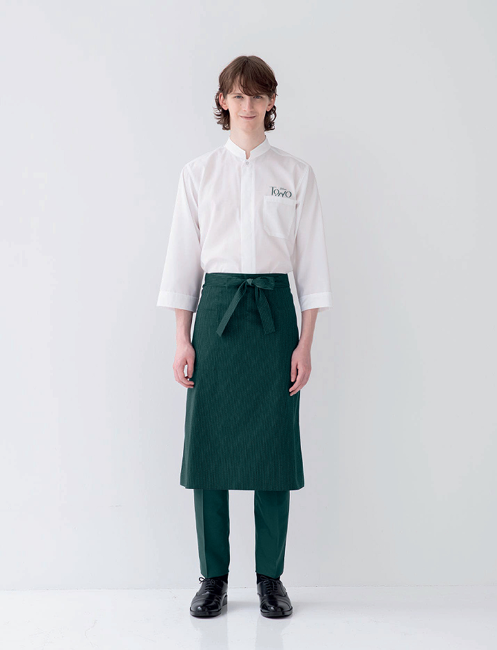
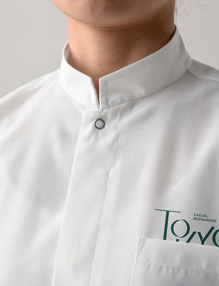
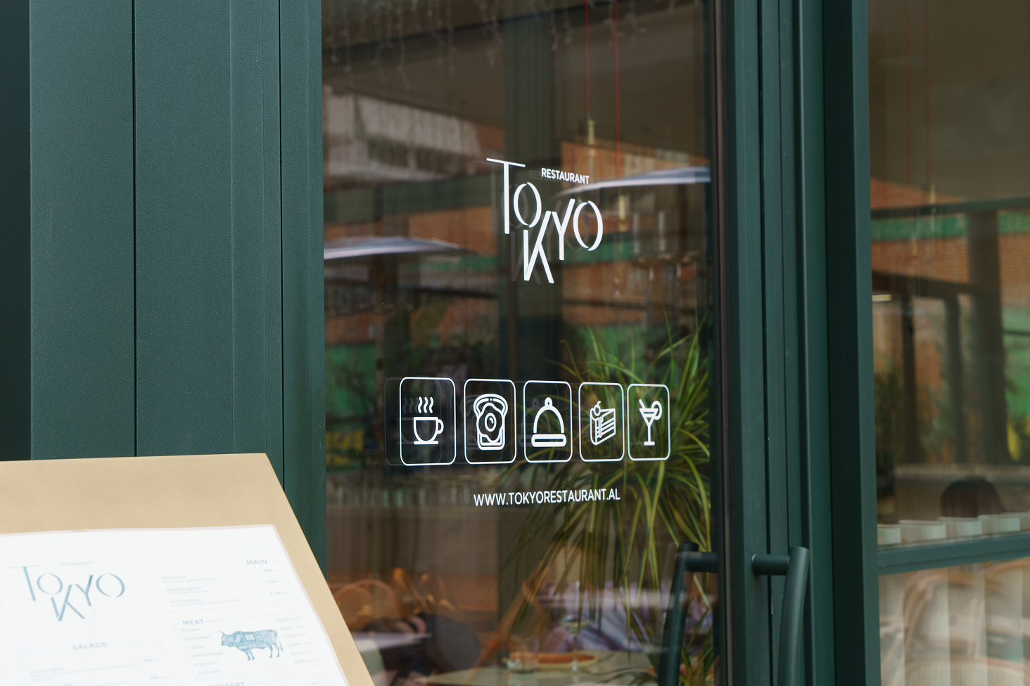
The brand identity was further developed through a cohesive stationery system, ensuring consistency across all brand communications. Business cards, menus, and printed materials were designed to reflect the logo’s conceptual language and reinforce the restaurant’s visual personality.
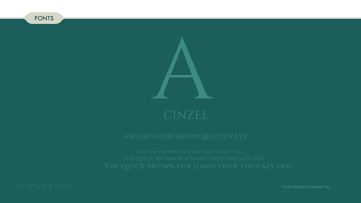
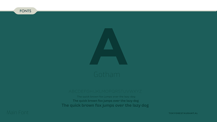
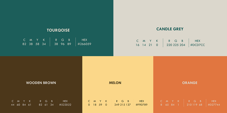
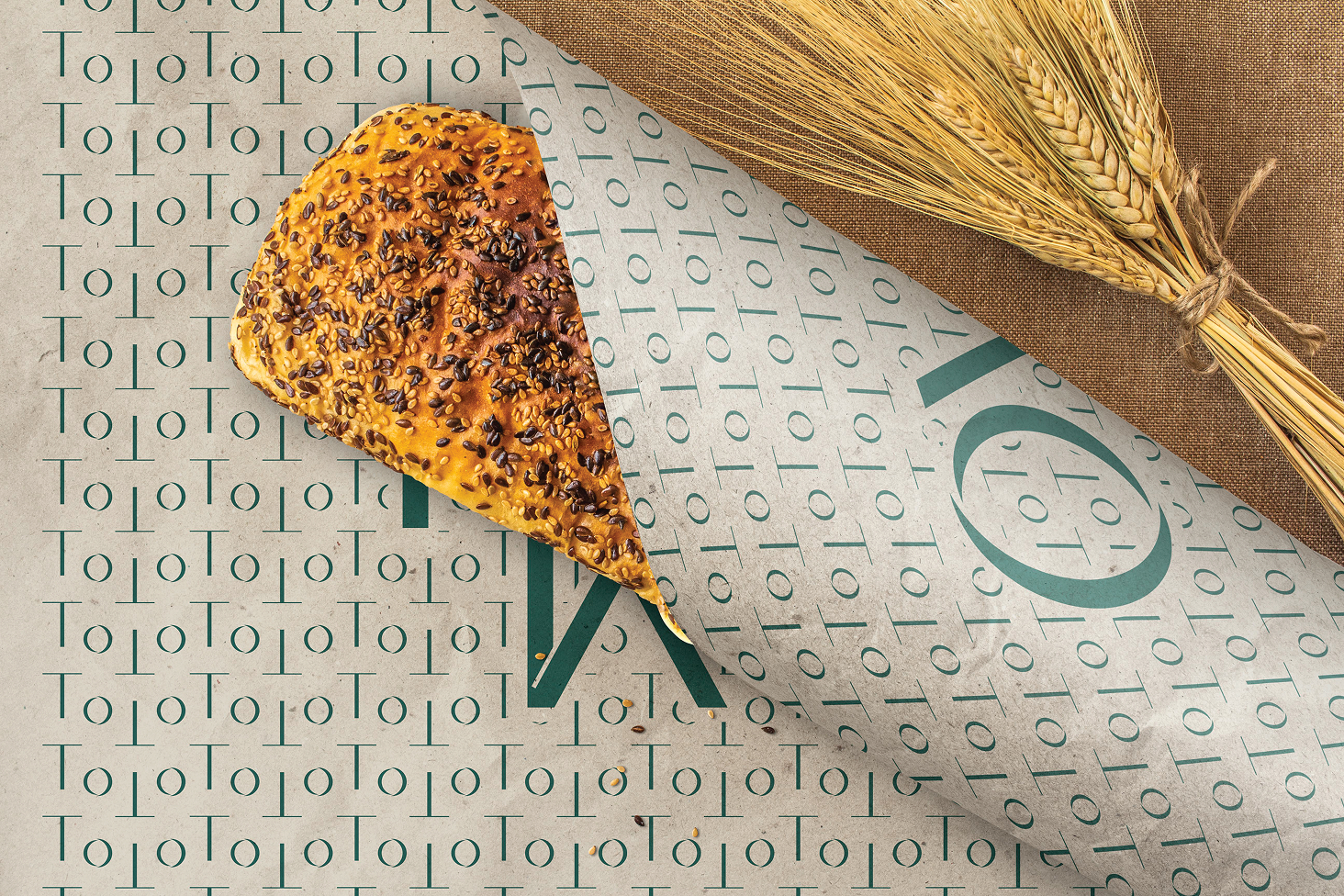
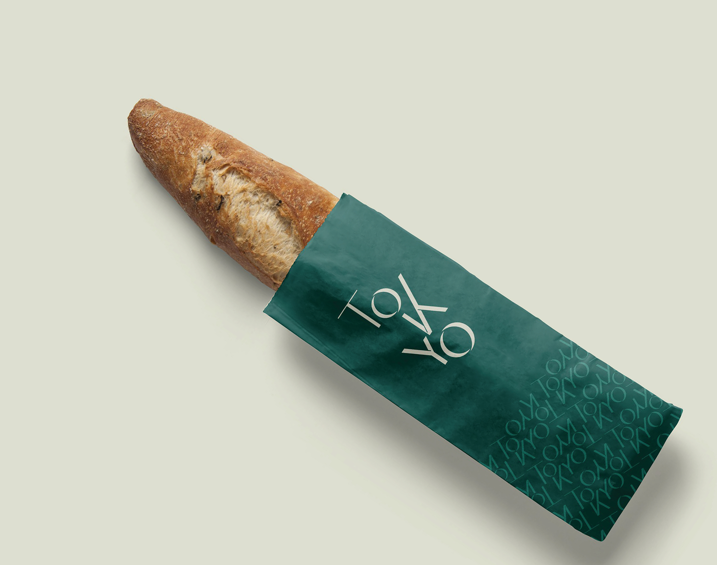
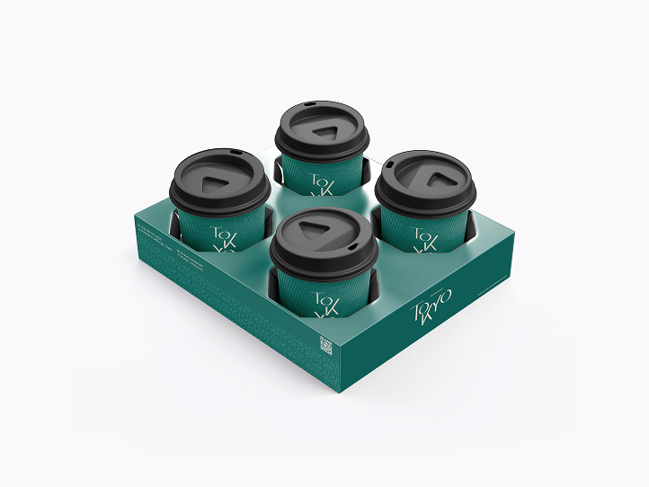
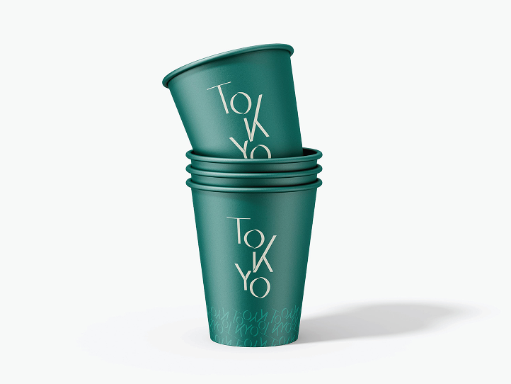
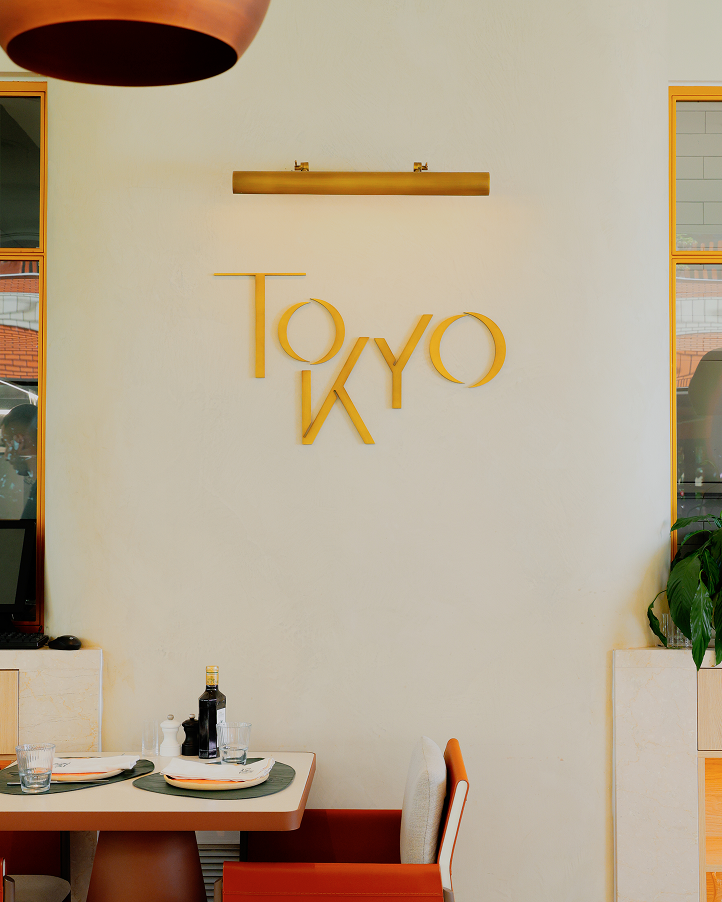
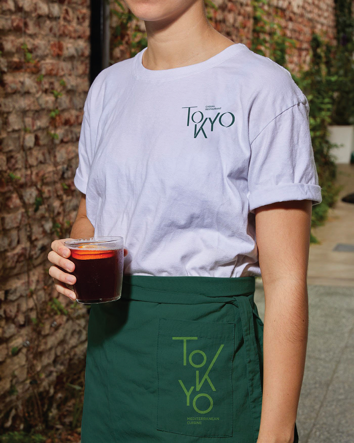
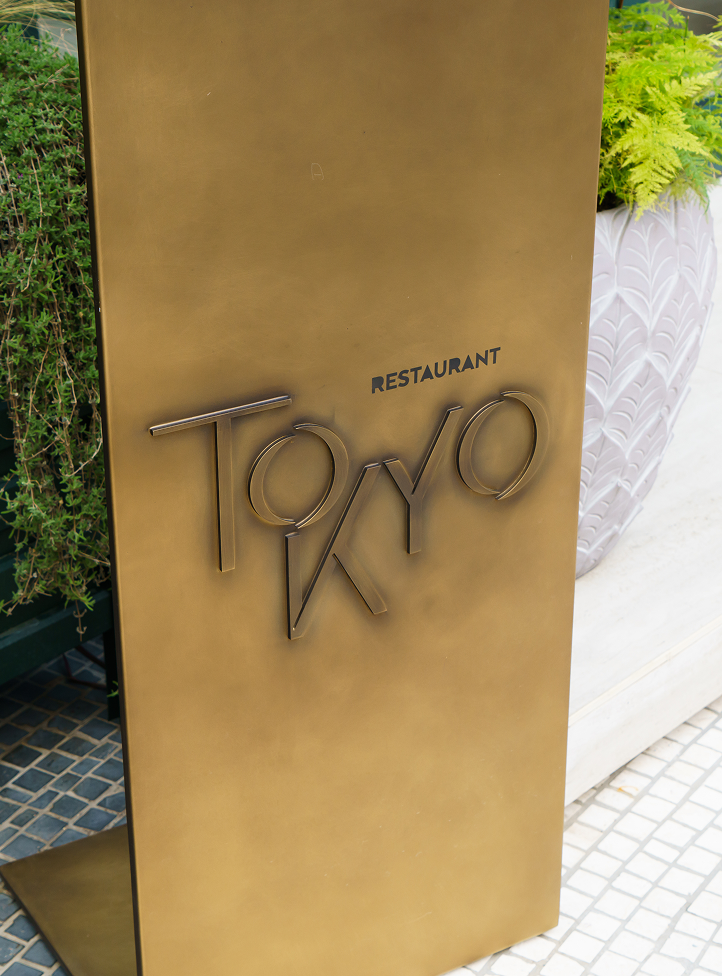
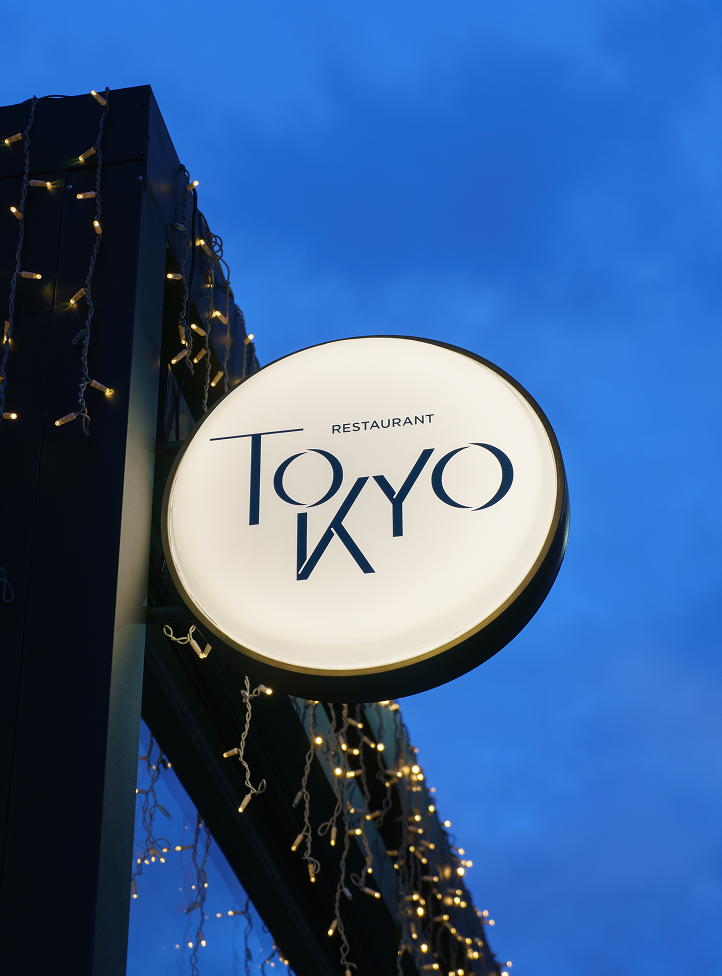
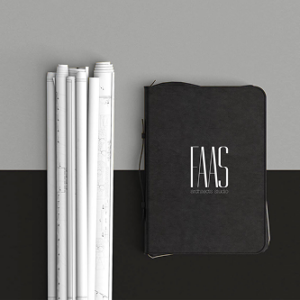
Through careful brand development, the identity was expanded beyond the logo into a flexible and recognizable system. Typography, graphic elements, and applications were designed to work together seamlessly, allowing the brand to adapt across physical and digital touchpoints while maintaining a strong and unified presence.