Stema Logo

CLIENT

Suko

PROJECT

Brand Identity
Application
Naming
Packaging
Film & Motion Graphic
Photo & Video Production

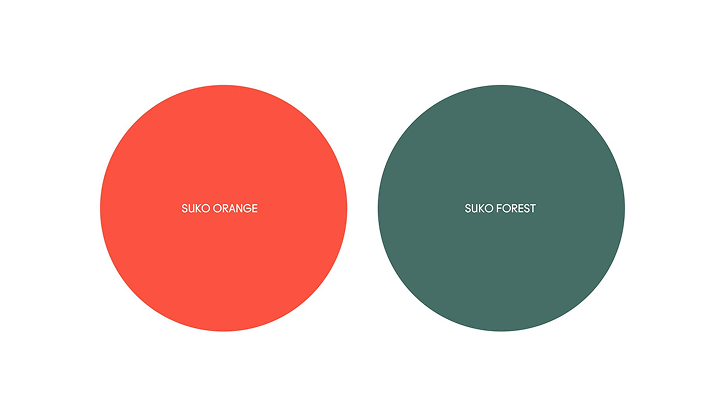
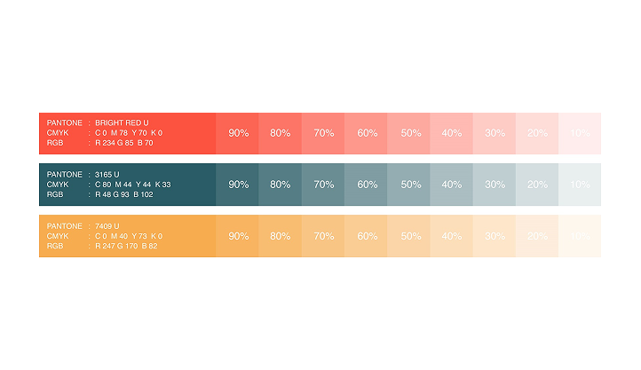
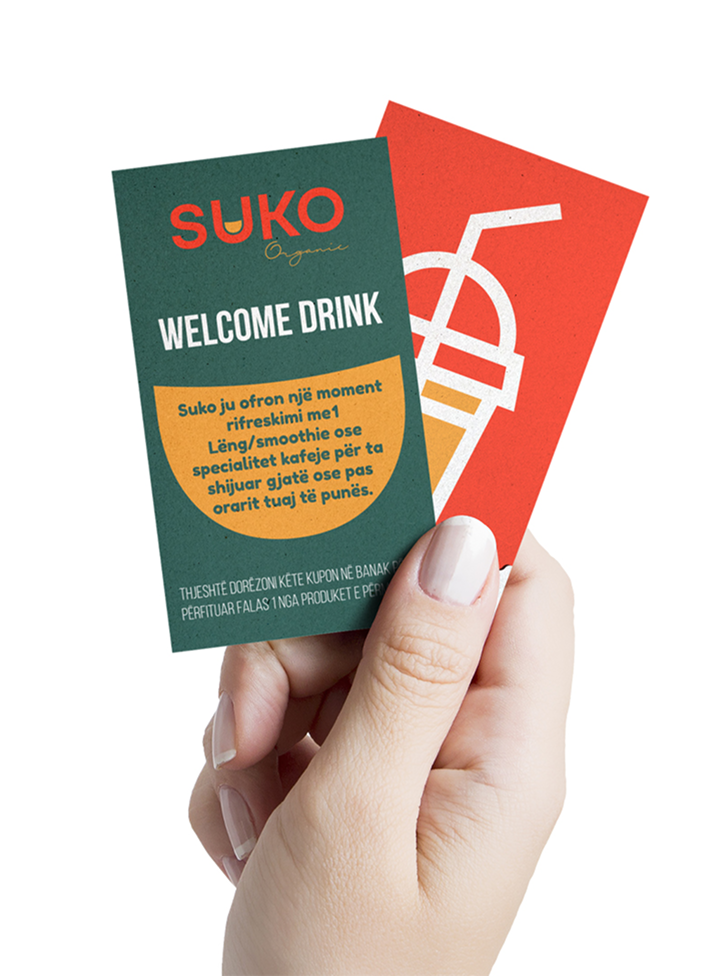
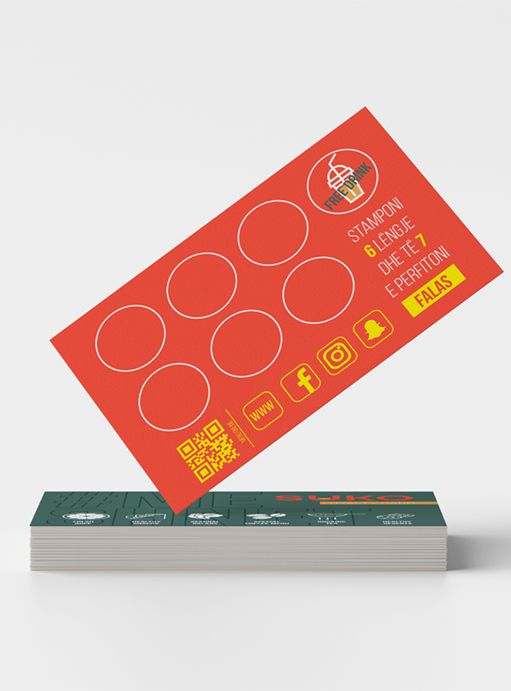
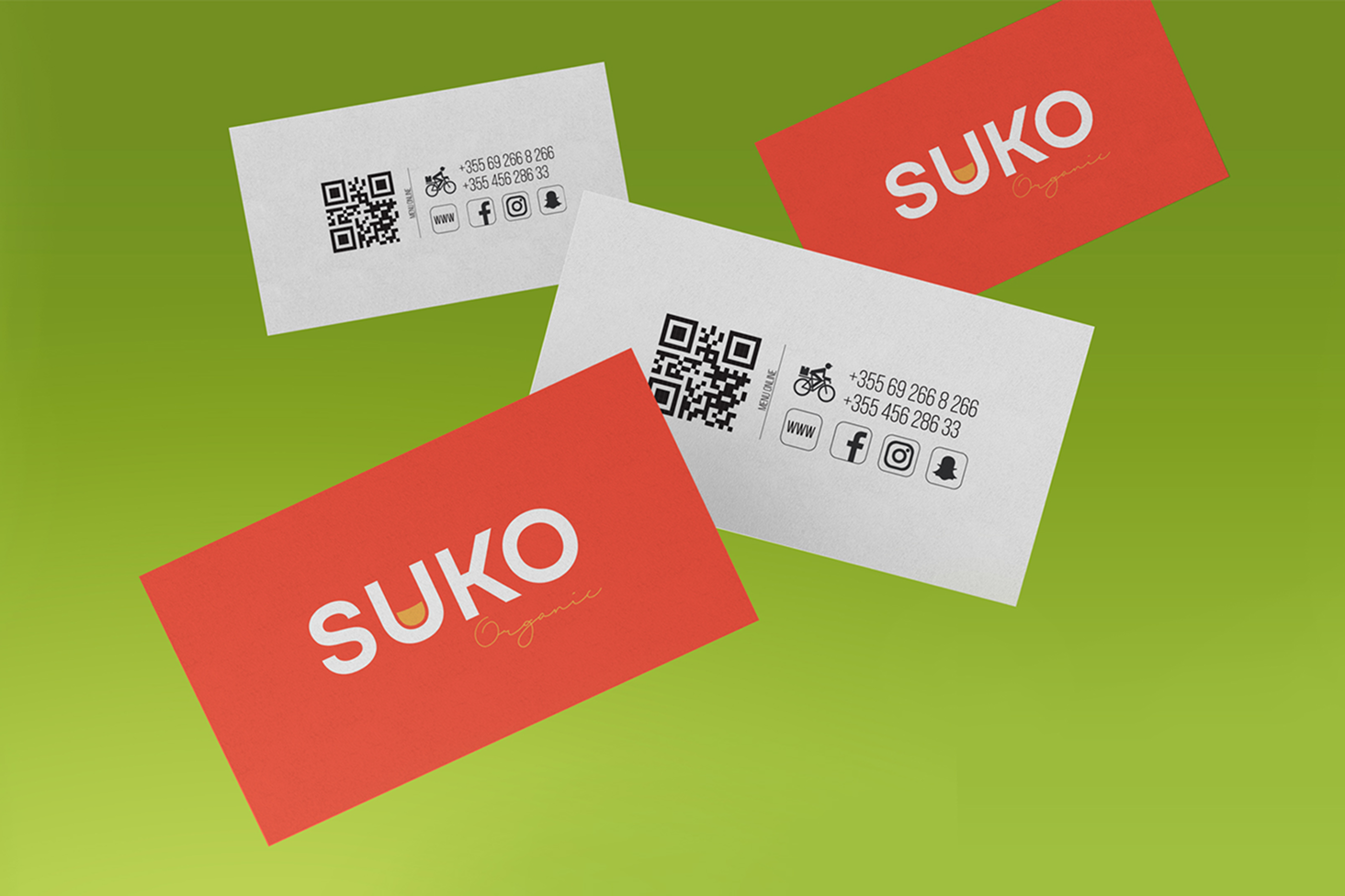
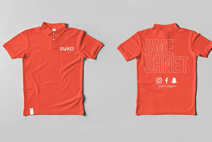
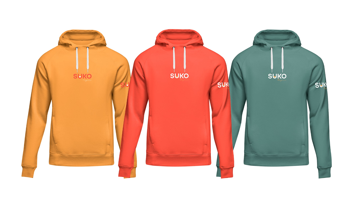
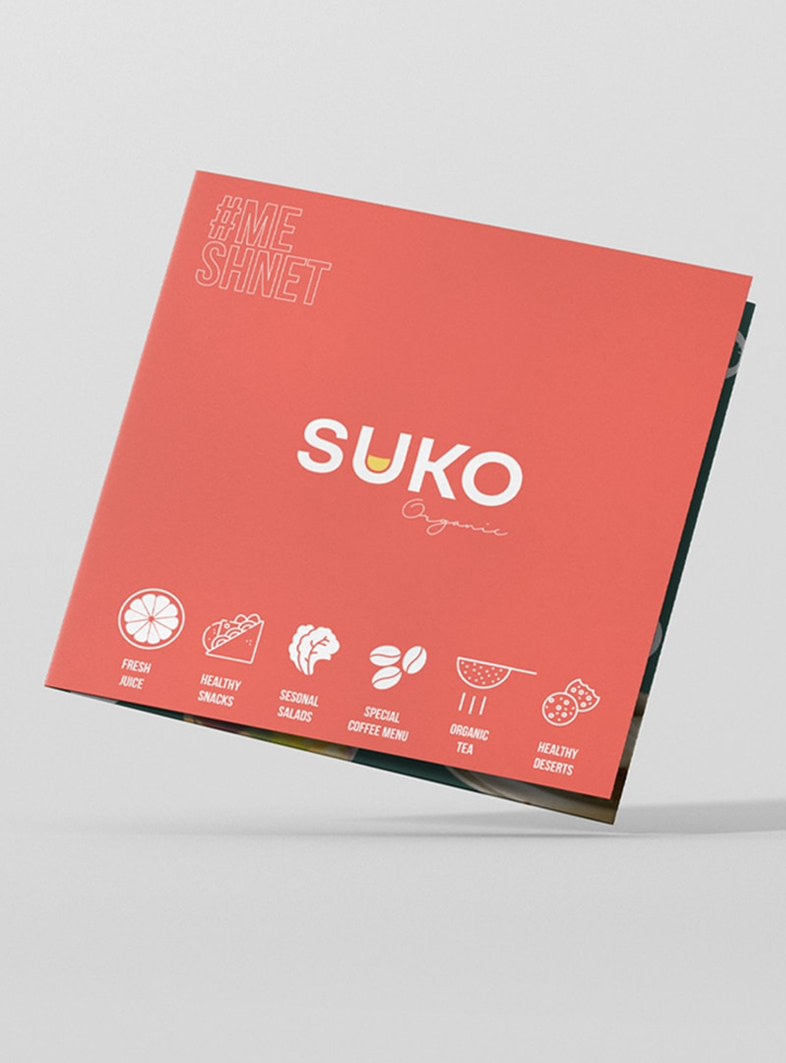
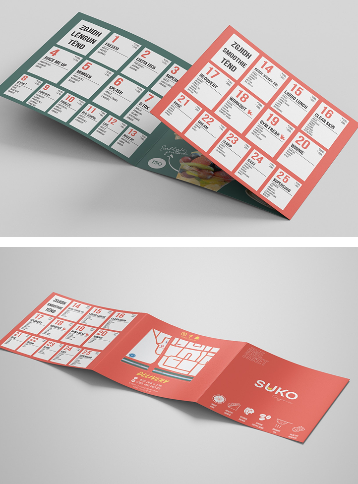
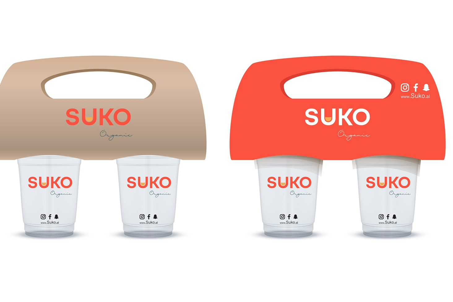
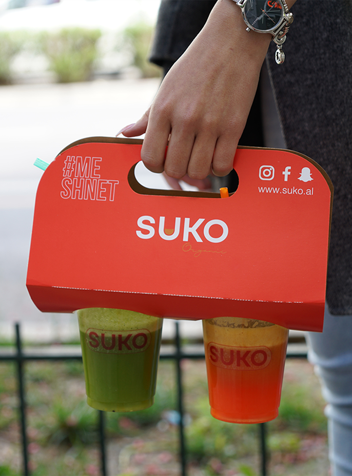
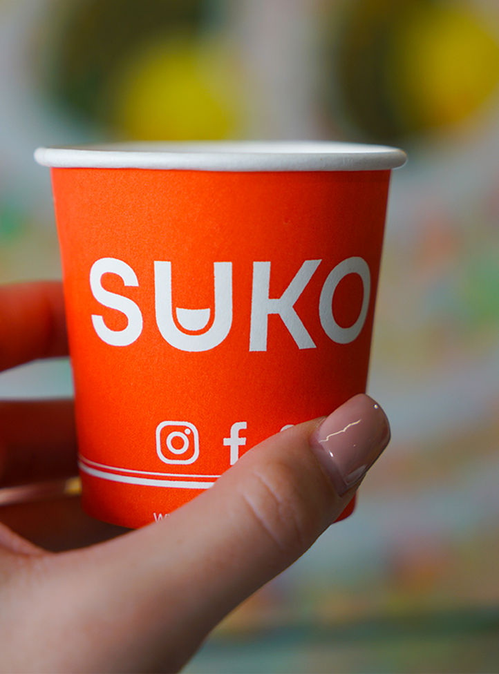
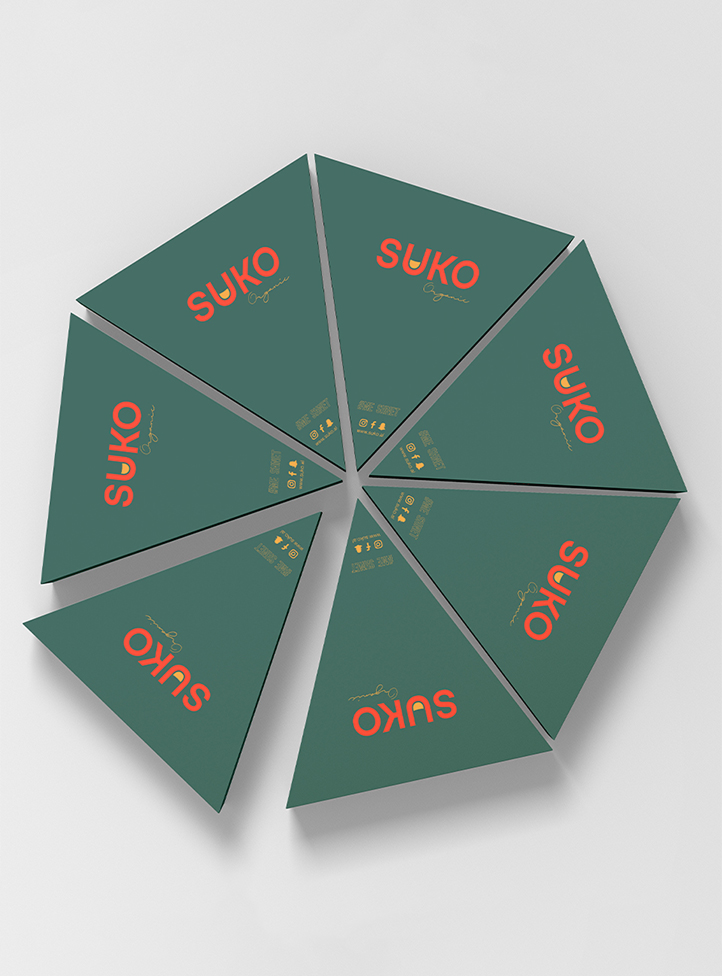
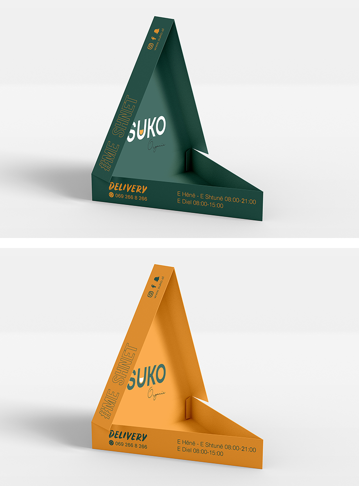
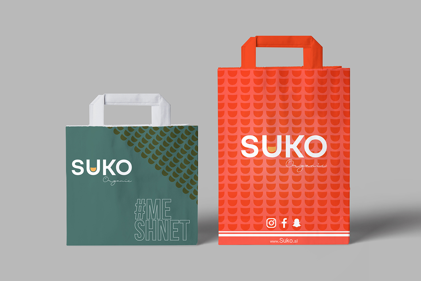
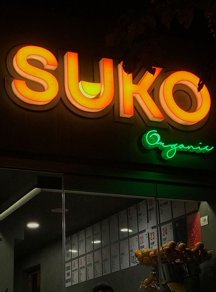
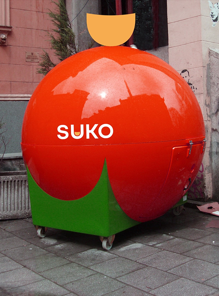
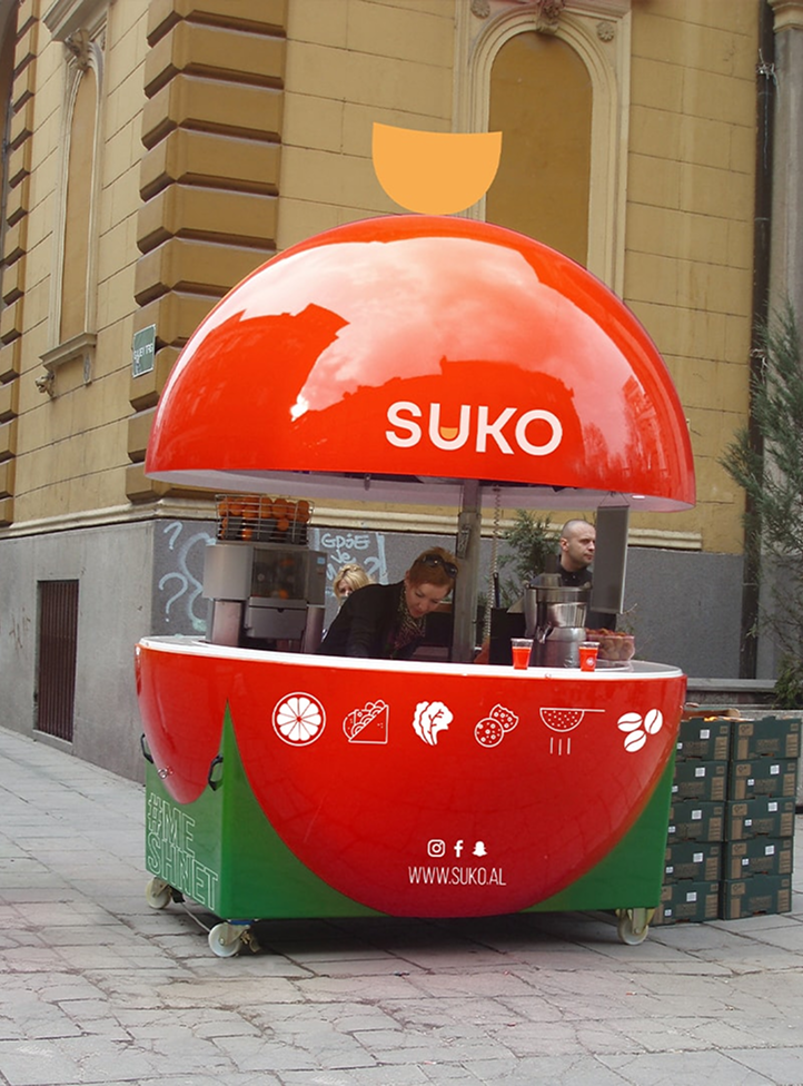
A vibrant project for a healthier life, a project that supports people with energy, “thirsty” for action. Suko’s mission is to provide customers with an expansive number of quality and freshly made juices, smoothies, and small food products that are affordable and healthy.
The design team created two arrows as a symbol for representing the history, that is used as a secondary logo and as a repeat pattern on fabrics and finishes. We selected colours and materials that coordinate with the accents of gold and green of the old interior design.

Our core brand colour palette made up of two colours; Suko Orange red and Suko Forest. Each one has a specific usage depending on the audience we want to communicate to.

SUKO is bringing something fresh to modern urban culture, to welcome a different way of living healthier, happier, friendly experience, new and full of life.