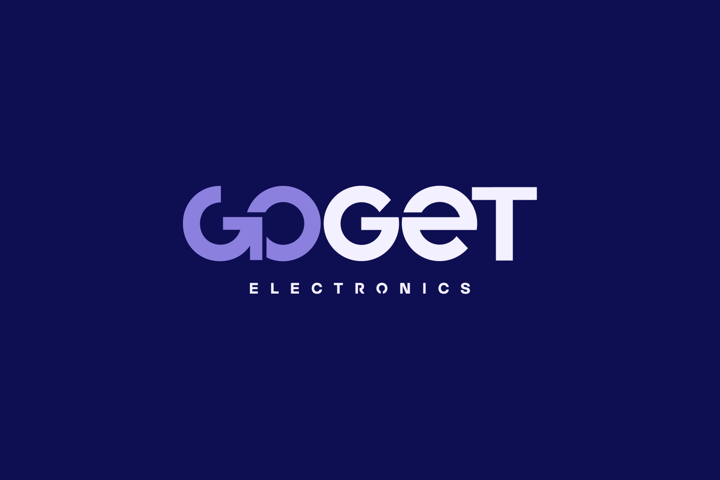
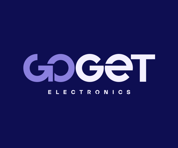
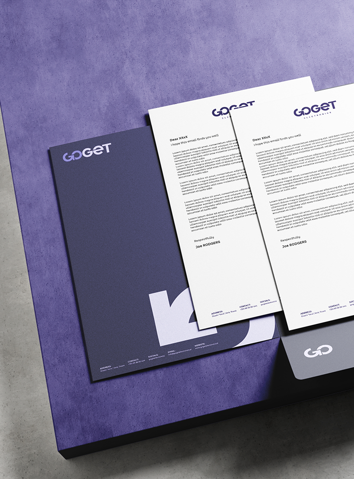
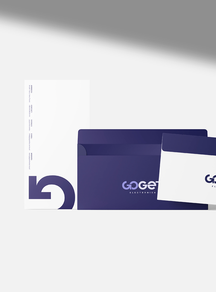
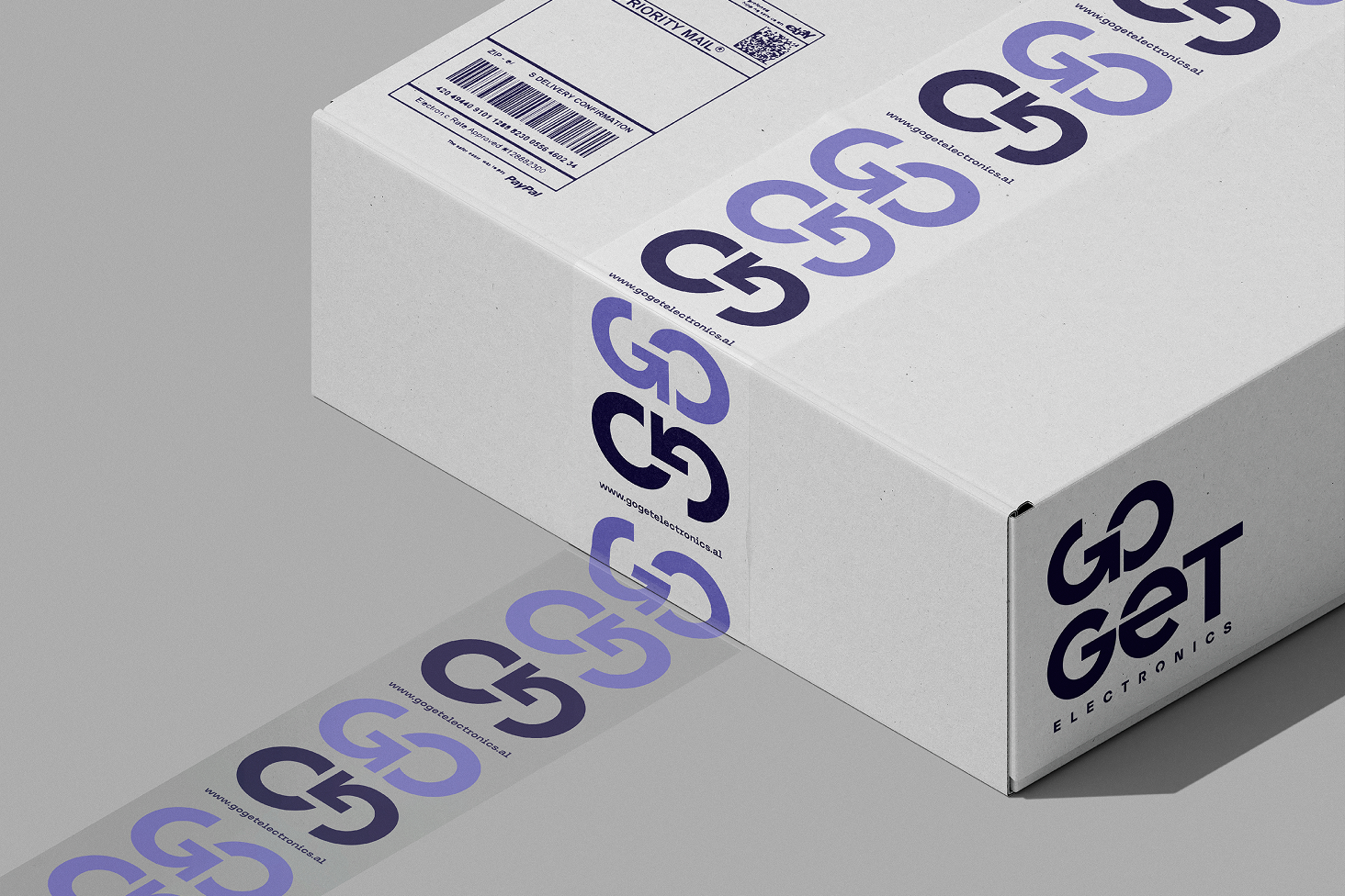
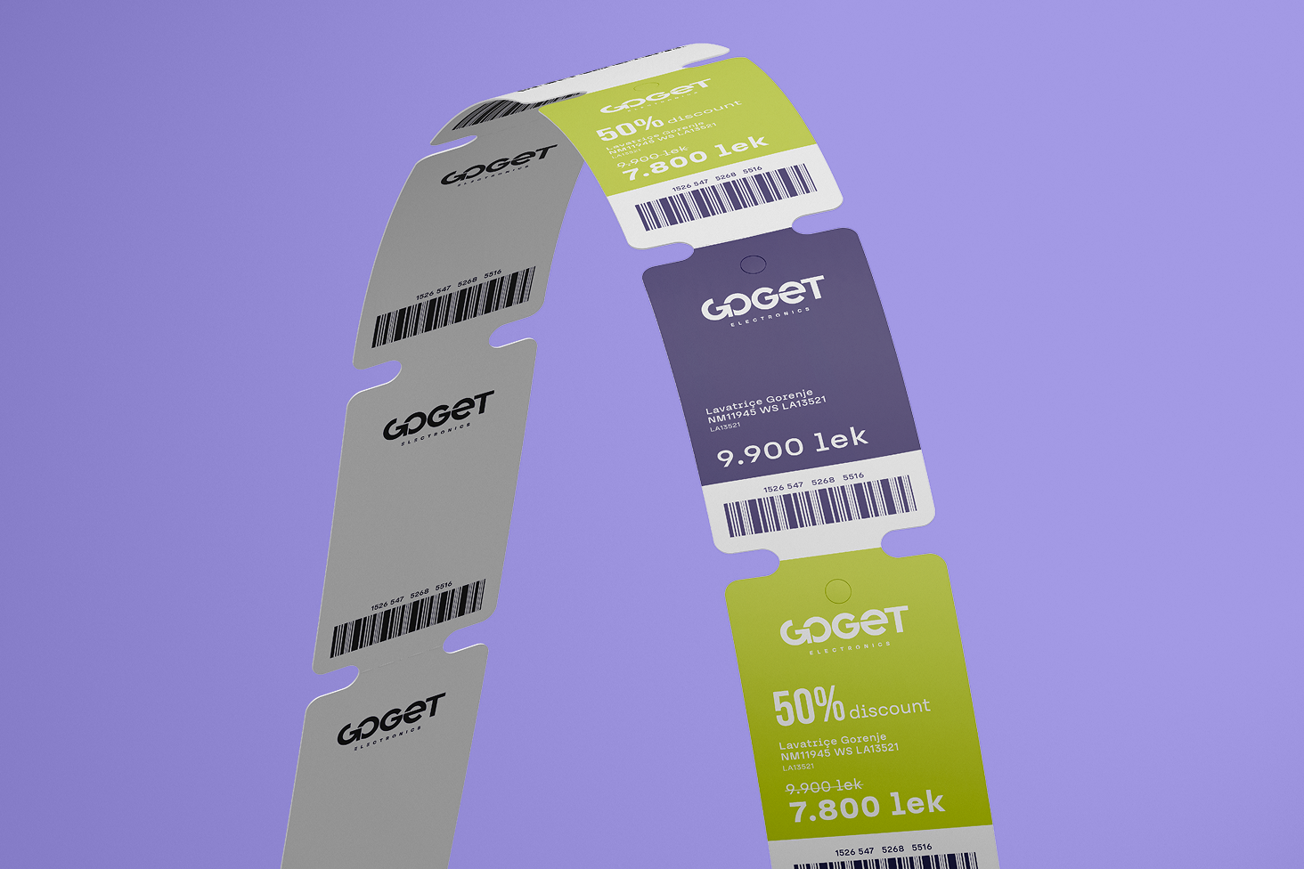
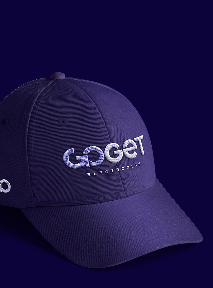
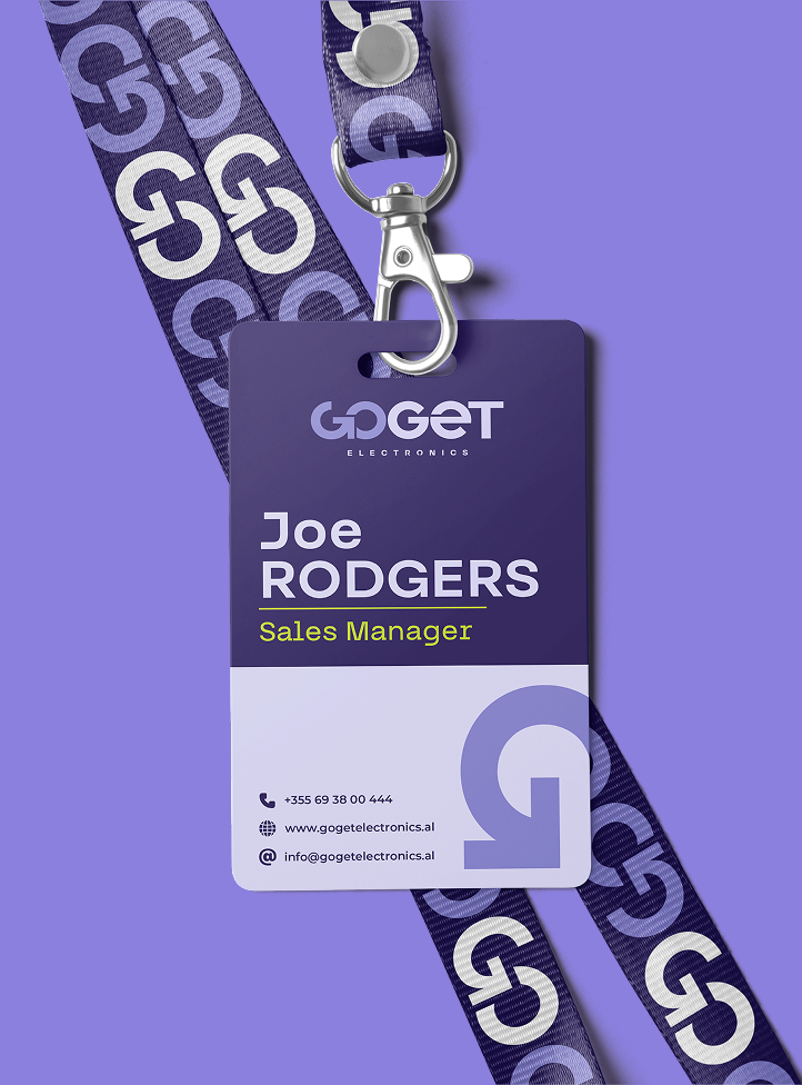
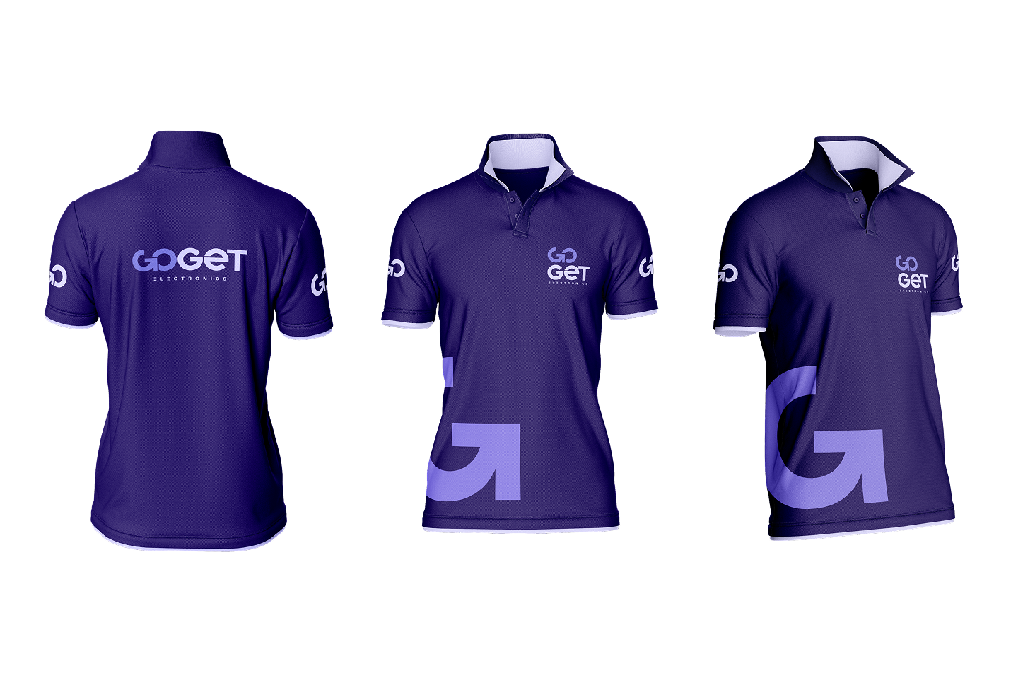
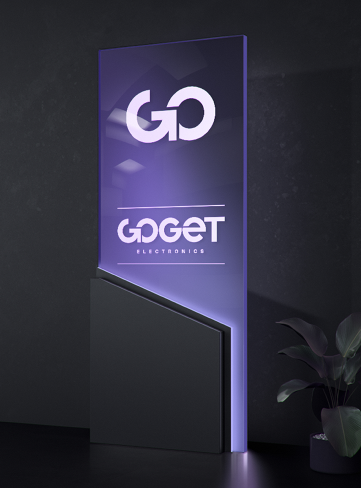
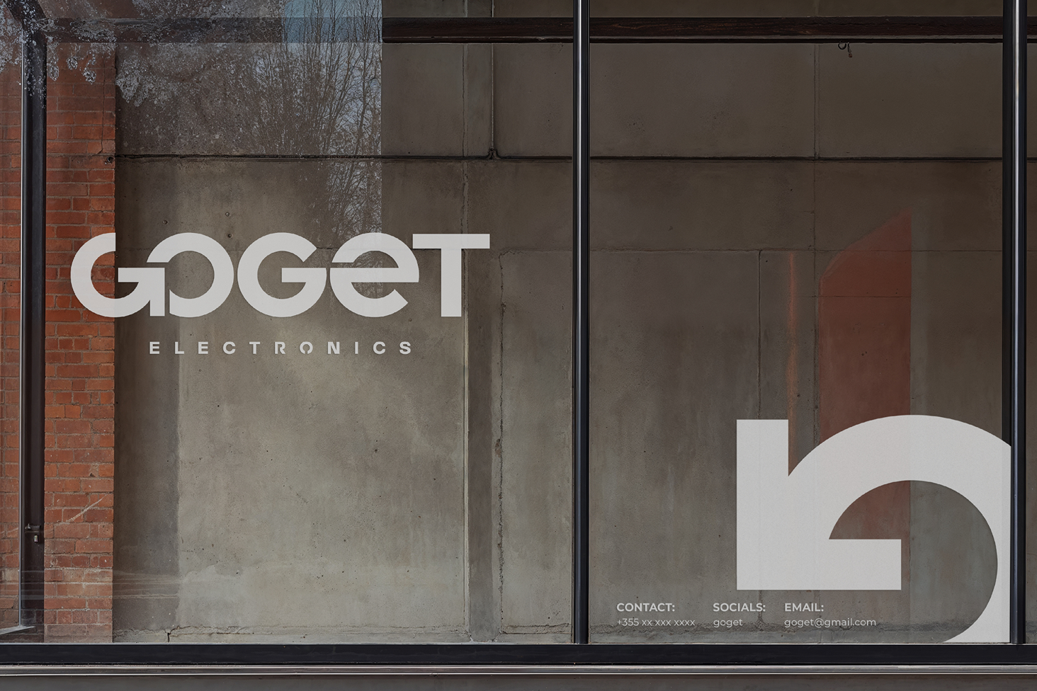
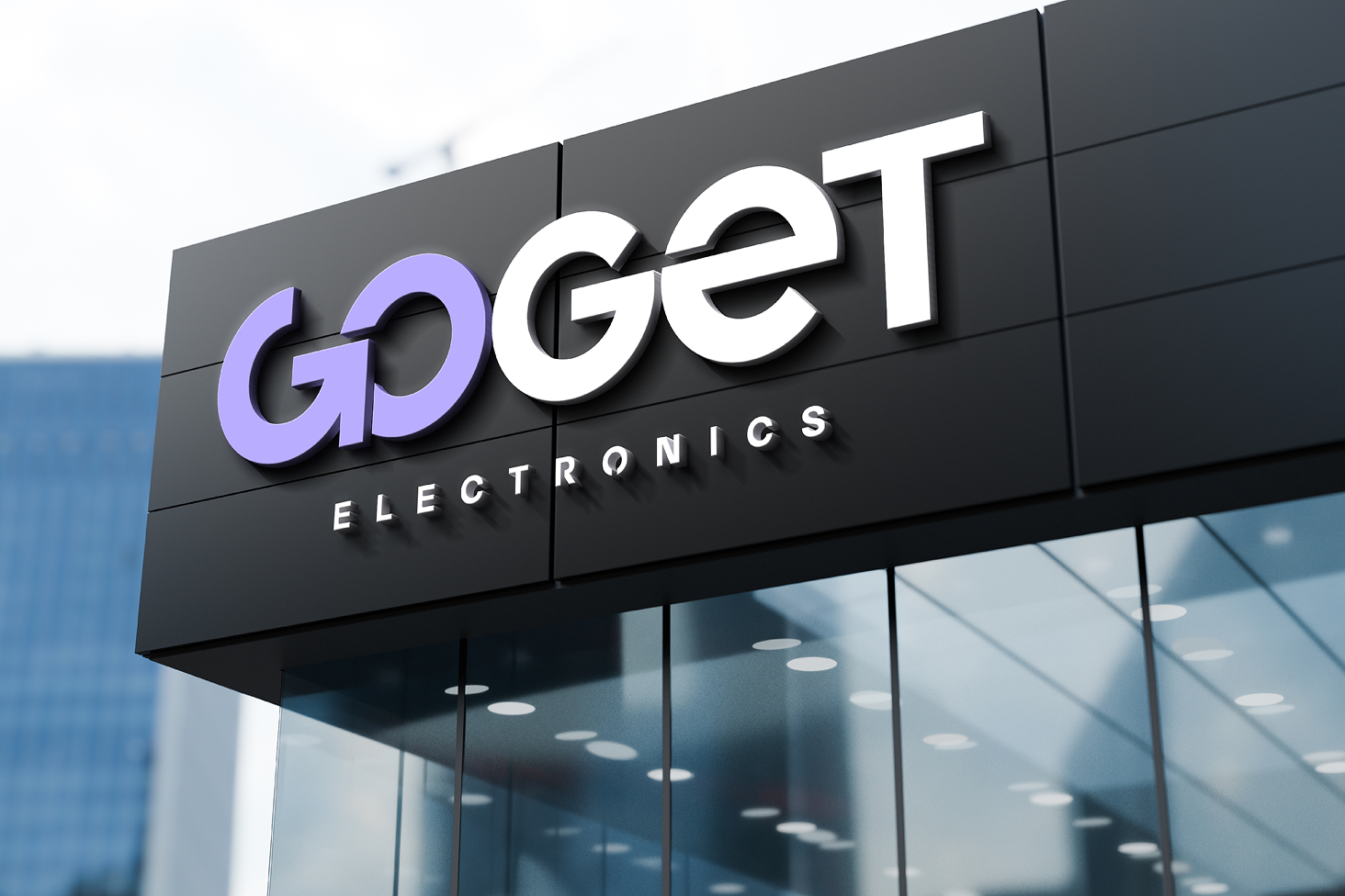
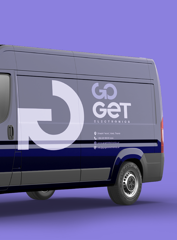
The GoGet Electronics logo is bold and modern, combining strong geometric typography with a subtle
arrow element. The arrow, integrated into the letter “G,”
conveys movement, direction, and urgency —
encouraging customers to “GO” and get the electronics
they need.
This dynamic visual cue, paired with the
clean, heavy letterforms, creates a brand identity that is
both impactful and instantly memorable.